Consider a non-profit organization that relies on fundraising to operate. In most cases, there are multiple sources for this funding. This chart shows the funding sources for one such organization. In this case, there are four fundraising strategies included. Often, an organization will have a particular goal in mind in order to meet its financial needs. The following visualization shows the amount of the goal reached for each strategy. For example, if they hoped to raise $10,000 through Special Events, this chart indicates that they succeeded in raising 88% of that goal, a total of $8,800.
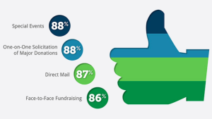
Image Source: http://gizmodo.com/8-horrible-data-visualizations-that-make-no-sense-1228022038
Questions for Students
1. What do you think is the purpose of this visualization? What story does it tell? What conclusions can you draw from it?
2. What are some things you think are good about the visualization? Why?
3. What are some things you think are bad and confusing? Why? What can be done to improve it?
4. Overall, is this a good or bad visualization? Why?
Discussion
One major problem with this visualization is that it is unclear. The format (filling up the thumbs-up with colors) is similar to a pie chart. The problem is that a pie chart should add up to 100% and each colored area should correspond to the data itself. In this case, the percentages do not add up to 100% and there is really no correlation between the percentage listed (e.g. 88%) and the shaded area, so the visualization does not reflect or illuminate the data.
This illustrates a misconception in data visualization that when you are dealing with percentages, showing them by area (such as in a pie chart) is always a good idea. But these percentages don’t indicate four parts of a whole. That is, the 88% means 88% of the goal for that particular category. It would make more sense to use four different pie charts, one for each of the four categories.
