This map shows the relative race distribution in the United States by showing the counties with specific populations higher than the national average. For example, a green county means that the Native American population in that area is higher than the national average. Keep in mind that this does not mean that the Native American population is higher than other populations in that area but that there are more Native Americans on average in that location than in the country as a whole. This visualization also contains an interactive aspect at the original site that allows one to focus on the population distribution in a specific state.
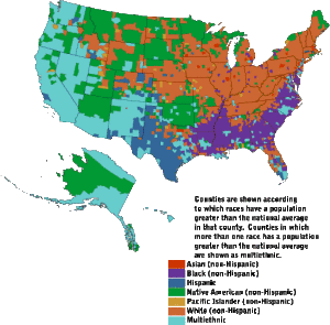
Image Source: http://www.censusscope.org/us/map_common_race.html
Questions for Students
1. Specifically what is the content of the data being shown here?
2. How is the map related to the data being presented?
3. What conclusions might one draw from this visualization? Remember to consider not only what you see but what you don’t see.
4. What are some things that this graphic does well?
5. What are some things that could be improved?
Discussion
Unlike the previous visualization, the map here is integral to the data. The color mapping shows the specific places where a certain group of people is most populous compared to the rest of the country. For example, the overall mapping tells us that the South (Georgia, Alabama, South Carolina, etc.) have a relatively higher black population than the rest of the country, while Texas has a higher-than-average Hispanic population. We might also conclude that the Midwest and Northeast have fewer minorities, considering the higher-than-average white population and that some Western states, such as California and Nevada, may be more ethnically diverse than other parts of the country. There are very few red areas, which may suggest that the Asian population is more evenly spread throughout the country. But the few red areas also tell a story. The red county in Indiana, for example, is probably the location of a big university that enrolls a high number of international students.
Considering all the information this one visualization gives us, it is quite clear. The key is easy to follow, and the overall map does tell a pretty clear story of how race is distributed. However, this is also a good example of a visualization that is so rich in detail and information that it requires careful thought and understanding to make any conclusions. It also has some disadvantages, particularly for people who are color-blind or have other visual impairments. The colors, especially the red and the orange, are similar and may be difficult to differentiate. A good visualization should be accessible to all users.
