This dynamic visualization compresses data from the American Time Use Survey (2014) to show how 1,000 Americans might spend their day minute by minute. The visualization uses dots to represent 1,000 people, color-coded according to their current activity. The dots also move to show the changes in activity (and sometimes location) throughout the day.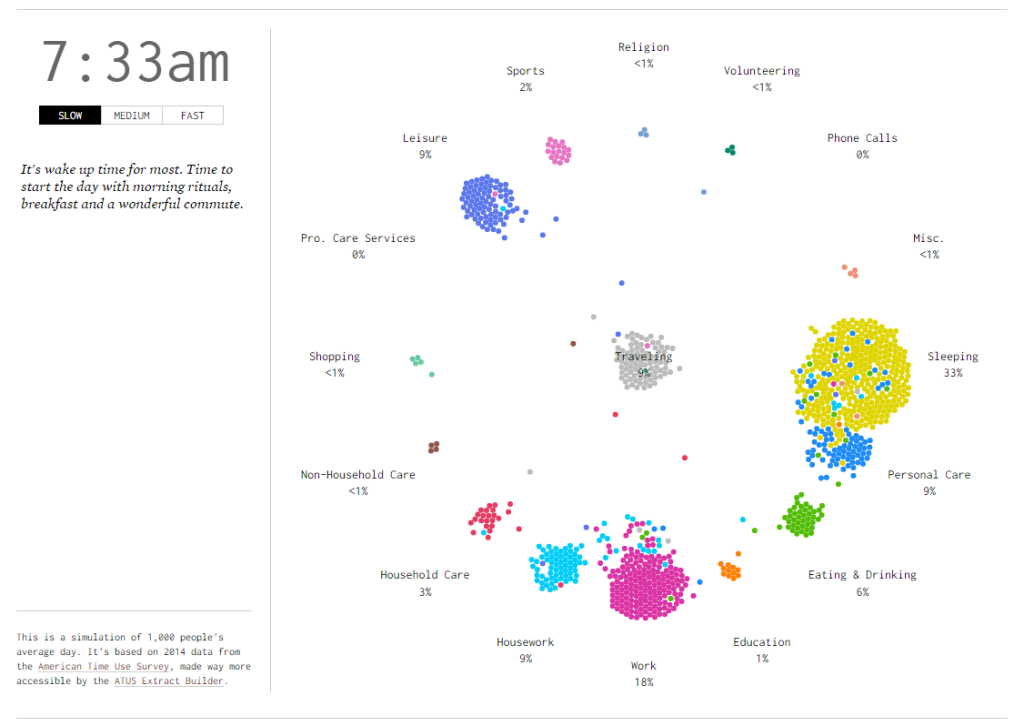
Image Source: http://flowingdata.com/2015/12/15/a-day-in-the-life-of-americans/
Questions for Students
1. What do you think is the purpose of this visualization? What conclusions can you draw from it?
2. What are some things you think are good about the visualization? Why?
3. What are some things you think are bad? Why? What can be done to improve it? Remember to consider not only what you see but what you don’t see.
4. Overall, is this a good or bad visualization? Why?
5. What might be some challenges in creating a visualization like this?
Discussion
It would be difficult (if not impossible) to follow the activities of 1,000 people for even one day, and even reading through 1,000 surveys about how people spend their time would be tedious. All that information would be difficult to really examine and consider in a useful way. This visualization gives us a way to examine the data dynamically, almost as if we were watching the activities of 1,000 people minute by minute throughout the day.
The visualization is creative and visually appealing. It uses a circle of activities to effectively organize and simplify the data, and the simple color-coding scheme allows us to quickly see the relative differences between the numbers of people engaging in each activity at a given time.
