The first known uses of bar charts to visualize data appeared in a 14th century publication plotting velocity of an accelerating object against time. William Playfair (1759 –1823), a Scottish engineer and political economist, is widely considered the inventor of line graphs, pie charts, and other graphs very familiar to us today. Below is a chart of his showing the Time Series of Exports and Imports: Denmark and Norway to and from England.
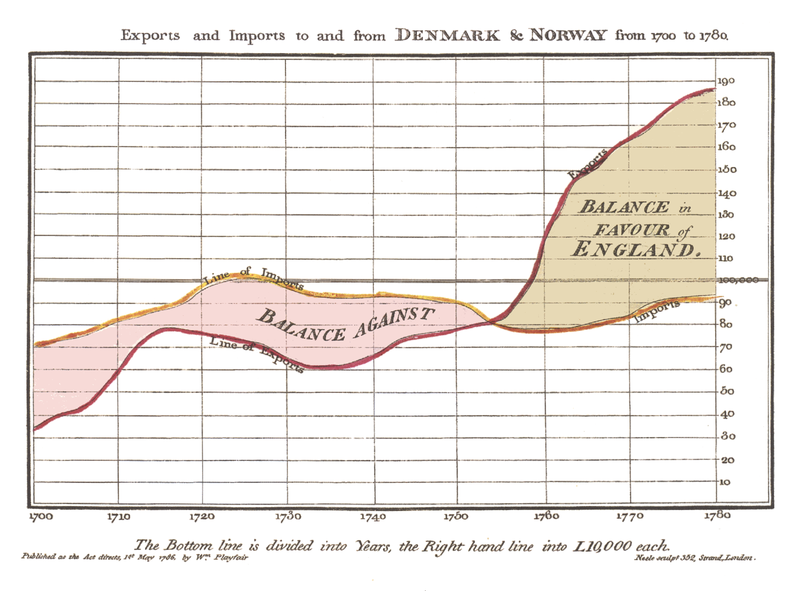
Image Source: https://en.wikipedia.org/wiki/William_Playfair
Charles Joseph Minard (1781-1870), a French civil engineer, made many novel contributions to the use of graphics in engineering and statistics. One of his most famous visuals is the map of Napoleon’s Russian campaign of 1812 shown below.
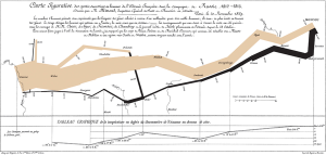
Image Source: https://en.wikipedia.org/wiki/Charles_Joseph_Minard
In this map, Minard tells the story of Napoleon’s army’s disastrous journey to Russia. It not only highlights the major depletion of the army, but it also shows factors such as the temperature and the army’s location relative to given dates. Many information scientists view his map as one of the best data visualizations ever drawn. Playfair and Minard’s charts shown are used in Edwards Tufte’s classic book, The Visual Display of Quantitative Information. Sample pages of this book are located at here.
Questions for Students
1. Look at each of the historical examples above (Playfair and Minard). What story does each visualization tell? Is the visualization clear? What makes each chart good? How could it be improved? In what other way could you tell the same (or similar) story by visualizing the same data in a different way?
2. Try to find another good example of a historical data visualization. What story does it tell? What makes it an effective visual?
Discussion
Playfair: Playfair’s graph is a nice visualization of England’s trade relationship with Denmark and Norway over time. The graph is simple and clear, showing how the balance in the trade went from being against England to being in England’s favor. The colors are used well, clearly showing the imports vs. the exports and using similar colors to show the differences. The story being told here is that moving into the late 1700’s, England began to export much more to these two countries, while the imports remained much steadier. This suggests that England experienced great economic growth during that time.
Minard: Minard’s visualization contains a surprising amount of information given the apparent simplicity of it. The chart tells the story of Napoleon’s army’s journey to Russia. Note the difference in sizes between the tan and the black lines. The width of the line indicates the number of troops at that location at that time. Even a quick look shows how many more troops there were going to Russia (tan) than there were on the return journey (black). Looking at the graph more closely reveals that Minard included numbers at different spots to give a more specific guide to understanding what happened.
The location of the lines is also important, as you can see lines branching out at different places, indicating when and where subsets of troops joined or left the main host. The chart shows locations, dates, and even temperatures (an important factor considering that Napoleon’s army was largely defeated and depleted due to the harsh Russian winter.)
