The matplotlib library is a python 2D plotting library. In the CSE course, it is first introduced in Activity 1.3.2 Python Variables and Functions and also used in Activity 3.1.5 Histograms and Distributions. For more information about the matplotlib library see: http://matplotlib.org/
In matplotlib, there are many classes, such as matplotlib.figure.Figure, matplotlib.axes.Axes, matplotlib.lines.Line2D. We explore the matplotlib.lines.Line2D class here. First we need to import matplotlib.
import matplotlib.pyplot as plt
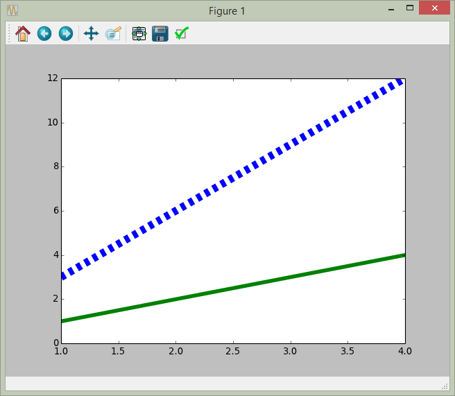
In addition we need to define the x and y coordinates of the lines we want to draw. The following four lists represent the x and y coordinates of two different lines.
# x and y coordinates of line 1
x1 = [1,2,3,4]
y1 = [1,2,3,4]

# x and y coordinates of line 2
x2 = [1,2,3,4]
y2 = [3,6,9,12]
Next, we use plt.plot(x1, y1, x2, y2) to plot the two lines. The plot() method will return the line objects. If we print the return value, we can see plot() returns a list of matplotlib.lines.Line2D objects, and there are two objects in it. For more information about plot() function please see http://matplotlib.org/api/pyplot_api.html#matplotlib.pyplot.plot
lines = plt.plot(x1, y1,x2, y2)

print lines
print len(lines)
## result:
## [<matplotlib.lines.Line2D object at 0x000000000A24E9E8>, <matplotlib.lines.Line2D object at 0x000000000A24EA58>]
## 2
Now that we have the line objects, we can change their attributes using methods. For example, we can use set_linewidth() to change the width of the line, set_linestyle() to change the line style, and set_color() to change the color of the line.
line1 = lines[0]
line1.set_linewidth(5)
line1.set_color("green")

line2 = lines[1]
line2.set_linewidth(10)
line2.set_linestyle("dashed")
line2.set_color("blue")

plt.show()
There are a number of interesting methods and attributes in the matplotlib.lines.Line2D class. More information can be found in this page: http://matplotlib.org/api/lines_api.html
The matplotlib library allows one to produce a wide range of plots and visualizations. In general, students enjoy experimenting with different types of visualization of data. While a number of the features are also plotting features in Excel, using Python and matplotlib can give students a different feeling of control and achievement.
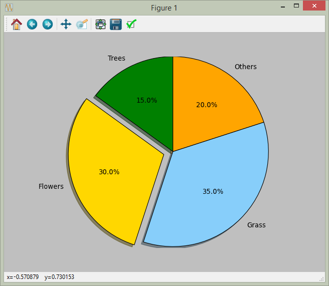
The following program draws a pie chart. More examples can be found in matplotlib gallery (http://matplotlib.org/gallery.html)
import matplotlib.pyplot as plt

# The following code will draw a pie chart based on the data
labels = ('Trees', 'Flowers', 'Grass', 'Others')
sizes = [15, 30, 35, 20]
colors = ['green', 'gold', 'lightskyblue', 'orange']
explode = (0, 0.1, 0, 0) # only "explode" the Flowers slice

plt.pie(sizes, explode=explode, labels=labels, colors=colors,
        autopct='%1.1f%%', shadow=True, startangle=90)
# autopct is a format string to organize the label placed inside the slices

# Set aspect ratio to be equal so that pie is drawn as a circle.
plt.axis('equal')
plt.show()