This visualization shows the distribution of race and ethnicity in the United States starting in 1960 and projected until 2060. It suggests that the white population relative to others will be almost halved by 2060, while the relative population of Hispanics will double.
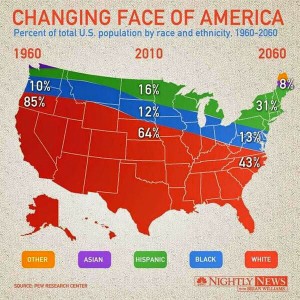
Image Source: https://flowingdata.com/2014/04/16/weird-stacked-area-map-thing/
Questions for Students
1. What do you think is the purpose of this visualization? What conclusions can you draw from it?
2. What are some things you think are good about the visualization? Why?
3. What are some things you think are bad? Why? What can be done to improve it?
4. Overall, is this a good or bad visualization? Why?
5. Using the same data, create another better visualization.
Discussion
Putting these percentages on the map of the United States suggests conclusions that are not valid. For example, it makes it seem that location is a factor in the data. But obviously, the Asian population in the United States is not restricted to Northern Washington and Maine. The only thing really useful in this visualization are the percentages that are written out for the given years, but these could just as easily (and more clearly) have been written out in a simple table. A good rule of thumb for any visualization is that if there is a map involved, location should be a factor.
