The wealth distribution data is so surprising to most people that it deserves a second look. A study done in 2012 asked 5000 randomly chosen citizens what they thought the wealth distribution in the US was and what they thought it should be in a perfect world. It turns out that what people thought the distribution was is not at all close to the actual distribution.
The image below is actually a screenshot from a video called an Infographic (i.e., a presentation of information using a graphic visual representation to communicate data effectively). Watch the video with your students. The chart shows the wealth distribution in the United States–including what people think it is, what people think it should be, and what it actually is.
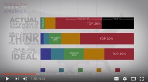
Image Source: https://www.youtube.com/watch?v=QPKKQnijnsM
Questions for Students
1. What story does this visual tell?
2. This visual contains similar information to the previous one. How does it improve upon the previous one? Be specific.
3. Comparing this visualization to the previous one, which one gives more information?
4. The subsets of the population here are different than in the previous visualization. Does dividing the population into 5 equal subsets (20% each) help clarify the data?
5. Overall, is this a good or bad visualization? Why?
Discussion
Although this visualization deals with the same kind of data as the previous one, this one is much clearer. For one thing, there is no superfluous clutter. The graphs themselves are simple and highlighted as the only items with color on the screen. There is a key at the bottom, so that it is very clear what each section represents. Furthermore, the first graph made us strain to understand what the dimensions of the bars meant–height and width. Here, the population is divided into equally sized subsets of 20% each, so there is only one dimension we need consider–the relative lengths of the colored sections. The message is much clearer, not because the message is different, but because there is nothing to distract from it. The simplicity also allows us to look at the three graphs together. This visualization has at least three times the information as the previous one, and yet it is more accessible and understandable.
